
Logo Design for Ruby, Tinto De Verano
Pro Bono Project
THE ASK
Logo Design
BACKGROUND
A friend of mine, who was studying in Madrid at the time, invited me to join her team for their year-end thesis as a designer. It was pro bono work, and it fulfilled a long-held desire of mine: crafting a brand identity for a wine company.
Tinto de Verano, akin to sangria, is a popular summer red wine in Spain, typically mixed with equal parts red wine and soda.
Ruby, a novel concept, is an eco-friendly premium Tinto de Verano crafted from top-tier wine. It boasts organic certification and originates from a vineyard employing ecological practices, eschewing artificial chemicals. Sustainability is a cornerstone of its production.
The project resonated with me for its essence—cool, refreshing, luxurious, and embodying the Spanish lifestyle. Its appeal transcends seasons, offering a chic, stylish, and indispensable beverage. My task was to design a logo that exuded distinction, practicality, and versatility—a creation characterized by elegance that could seamlessly traverse various platforms.
Concepts
CHOSEN OPTION
The script font was selected for its ability to embody the artistry and fluidity of hand lettering and calligraphy, adding a personal touch, in my view. This choice enhanced Ruby's organic ethos, connection to nature, and commitment to sustainability.
CONCEPT 1
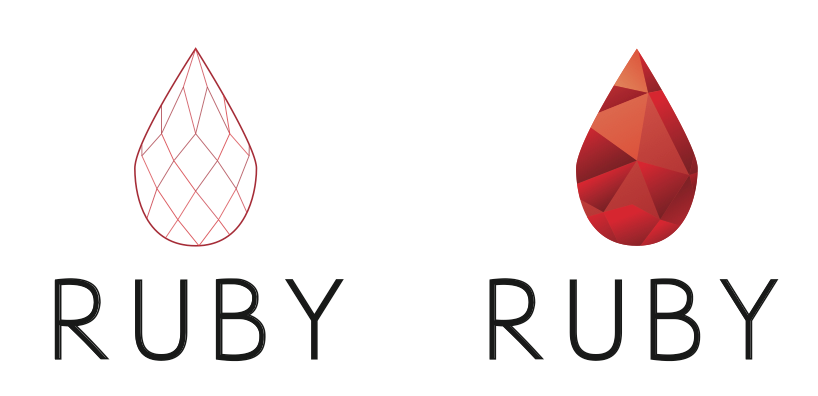
An actual ruby-inspired shape was crafted to elevate the winery's name, Ruby. It had the potential to stand as an independent icon or be seamlessly integrated into the entire bottle design. Paired with a flexible font, this approach enables the brand to exude playfulness, vibrancy, and depth.
When I introduce concepts 2 and 3, I enjoy surprising by unveiling bold and innovative ideas.

CONCEPT 2
This concept blends patterns and typography to elevate the wine's hue through lettering while conveying the essence of the drink's flavor: refreshing, fruity, and reminiscent of summer.

CONCEPT 3
Drawing inspiration from Vogue's sophistication and Spain's vibrant colors, I experimented with the typeface, removing certain lines and incorporating floral elements. The goal was to elevate this summer beverage to a luxurious status, moving beyond being just a seasonal indulgence.
Testimonial
[Angelika Tarasiuk, project lead] I reached out to Sara for help at first to get a general second option on our creative process. I have been following Sara’s work over the course of the last few years and have immense respect for her approach to design.
As both a friend and a confidant, her approach to our final project was completely professional. She immediately asked us open ended questions to get my team and I to think about the direction we would like to take with the brand. It led us to think beyond this initial new product launch of Ruby. We came up with the concept of an umbrella brand so that we could take into account the future state of the food and beverage industry.
The result was seamless. We opted to go with [chosen concept] of Sara’s design and was the foundation of all our online and offline creative campaign work. Without her guidance, we would have been left with an amazing project idea but without a clear direction of how to tie it all tougher.
As a marketing and sales professional, I truly believe that branding is something not to take lightly. It is the foundation of the values you as an organization strive to achieve. Regardless of the scale and size of the initiative, I recommend a brand specialist to always take part in the marketing strategy formulation so that as the product or service grows, so does the brand evolution.
It’s been three months since we completed the thesis project and we are keeping the marketing plan in mind as we look for prospective investors to take the idea into the execution stage. Our vision is to bring Ruby to markets across the world as it is something that we are sure once an individual’s tries, they will want more!
As my team and I like to stay “Summer is all year round”